Python - Matplotlib, Seaborn and Plotly
In this Global Life Expectancy Project, I aim to explore and analyse life expectancy data from various countries worldwide. Leveraging Python libraries such as Matplotlib, Seaborn, and Plotly, the data is showcased below in the form of two charts. These visuals, even if they are only two, allow us to interpret trends in life expectancy across different continents and genders.
The visual below, called a Choropleth, is a really awesome way of visualisng geographical. Through using Plotly, a interactive map can be developed, check the video below to see the interaction.
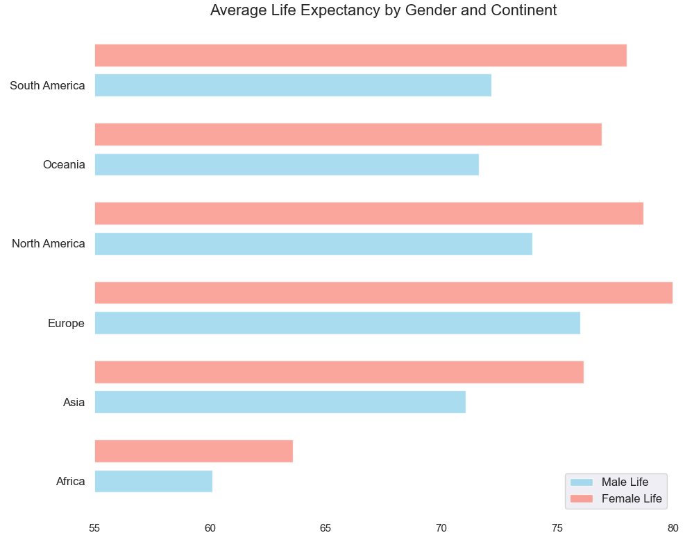
The analysis of life expectancy data reveals notable disparities across countries and continents. European nations like Monaco, Switzerland, and Sweden lead with higher life expectancies, with Monaco boasting an impressive 89.5 years. Gender differences are apparent, with women generally living longer lives than men across most regions. However, in certain African countries such as Chad and Afghanistan, both genders face lower life expectancies, with figures as low as 51.3 years.
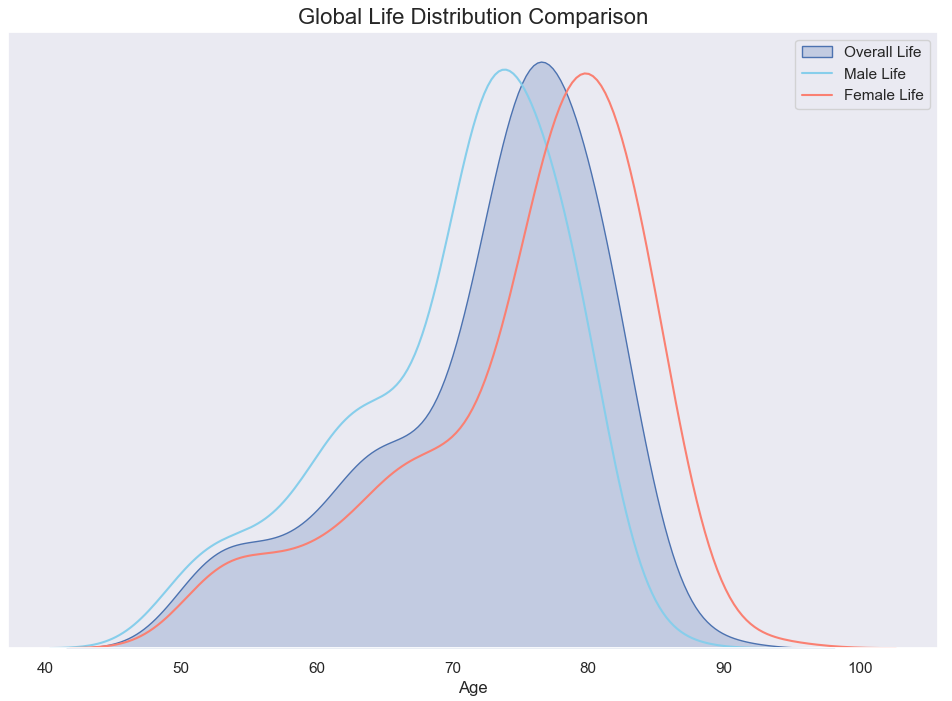
Notably, gender differences are observed, with women generally enjoying longer life spans than men across most countries. This is depicted on the Seaborn bar chart and age distribution seen below.
Visual libraries in Python are amazing
In my opinion, programming as a skill is extremely valuable for those working in data spaces. Take Python for example, a rich ecosystem of libraries used for its versatility, efficiency, and robustness for creating insightful analyses and aesthetically pleasing visualisations. Python's flexibility enables seamless integration with other data analysis tools and taking data exploration and analysis to the most basic and raw level. This makes it way easier to analyse complex datasets and gain deeper insights into the underlying trends and patterns.